_____________________
Georges Braque

George has made this complicated image through a series of pale colours and lines. I think he is trying to communicate how life can be so complicated a cluttered. I think he has done this well by using different lines and layering different shapes on top of each other. Almost how problems in life just pile on top of one another creating people to become stressed.
_____________________
Robert Rauschenberg

As soon as I saw this image, I fell in love with it. I love how Robert has used a variety of brushes in this painting. I also like how he has used different images from different cultures and put them all together. I think he is trying to communicate how many different cultures there are in the world and how much they differ but also how much they are alike. Through out the different images, he has used different colours and textures to bring the whole image together to make it look as good as it does.
_____________________
Marc Klee

This painting by Marc Klee is quite child-like but also very effective. I like how he has used a bright coloured background and layered different shapes in different colours. I think the image of of a forest like place with huts etc. I'm not sure what Marc is trying to communicate through this image by I have a feeling this it could be one of many things which is left for the reader to interpret.
_____________________
Judith Leyster

This image shows quite a happy looking person playing the ukulele. The painting is of Jester which I think, knowing how old the image is, is about the form of entertainment that was around at the time. In many of her images she uses musical instruments and happy looking people. I think throughout her images she's trying to communicate that music can bring people together and make them happy.
_____________________
Joan Miro

This piece of art made by Joan Miro is quite abstract. It almost looks like a doodle. I like the way she uses strong bold colours within her design and makes the background look like dirty and gritty. I think Joan is trying to communicate a number of things through this image however, I feel none of them are obvious and the reader has to look deeply and throughly to create the meaning of the image.
_____________________
Lucian Fraud
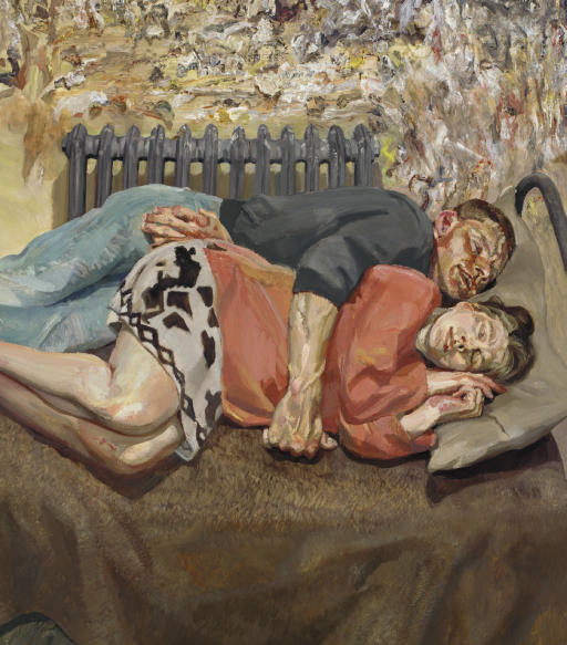
This painting by Lucian Fraud shows a couple together in bed. The man has his arm around this woman which in my eyes seems like he is protecting her from whatever may be a treat to her. I think Lucian's intention in this painting was to show how although there is no gender 'greater' than the other in modern day society still perceives it as the man having more power and essentially 'wearing the trousers' in most relationships.
_____________________
Hans Holbein

Han's has painted a very distinguished looking painting of Henry VIII. I like the way he has used rich deep colours in the background and made Henry himself look pale which contrasts well together. I also like the way the way Han's has painted Henry in the sense that the way he looks makes him seem very powerful and strong. It was probably painted this way because he was ordered to paint it like this as Henry was the King of England.
_____________________
Tang Yin

This image made by Tang Yin is a very powerful image. He has drawn what looks to be a valley somewhere oriental and has made the image look even more oriental by making the image only have cream and brown colours. I also like the way he has added red chinese text down the right hand side to make it look more authentic.
_____________________
Jenny Saville

This amazing painting by Jenny Saville is of a woman who is not at all in proportion. I think Jenny did this because she wanted to show all of her insecurities within this painting. The way she has made off the things she is insecure about like her feet, her legs and her hands show's how many woman feel in todays society and I feel Jenny gets this message across very well.
_____________________
Marcus Harvey

This painting by Marcus Harvey he has only used tonal colours which make the image appear in grayscale. I feel by doing this, he has shown the vulnerability of the woman in the painting. Also the image seems kind of blurred which accent the point I just made. I feel that the artist is trying to communicate the vulnerability of woman but also the strength and power as the black and white in the image make her look a lot more powerful.
_____________________

No comments:
Post a Comment